

Covid-19 Data Analysis


This week was a proper HUSTLE, and I remember telling our Teams Supervisor at Side Hustle why it was and that I am sure some people in my team have given up on Data Analytics.
THE TASK
The task is to Work on any Health/Disease Insight Analysis. We are to work on two of the following diseases; Covid-19, Hepatitis, Malaria, Lassa fever, Cholera, or HIV/AIDs. You are to scrap, clean, and visualize data using Power BI and create a Disease and Infection Monitoring Dashboard.
Our dashboard was to show these data:
- Infected Demographic by Sex
- Infected Demographic by age range
- Reported cases by date
- Affected locations heatmap
- Mortality by type
- Mortality by region
- Mortality by sex
- Mortality by age range
- Mortality rate
- Total death
We could not find any open-sourced data showing these in one place so we had to settle for a Kaggle data, COVID-19 status across countries that had most of the parameters we were to track.
THE DATA
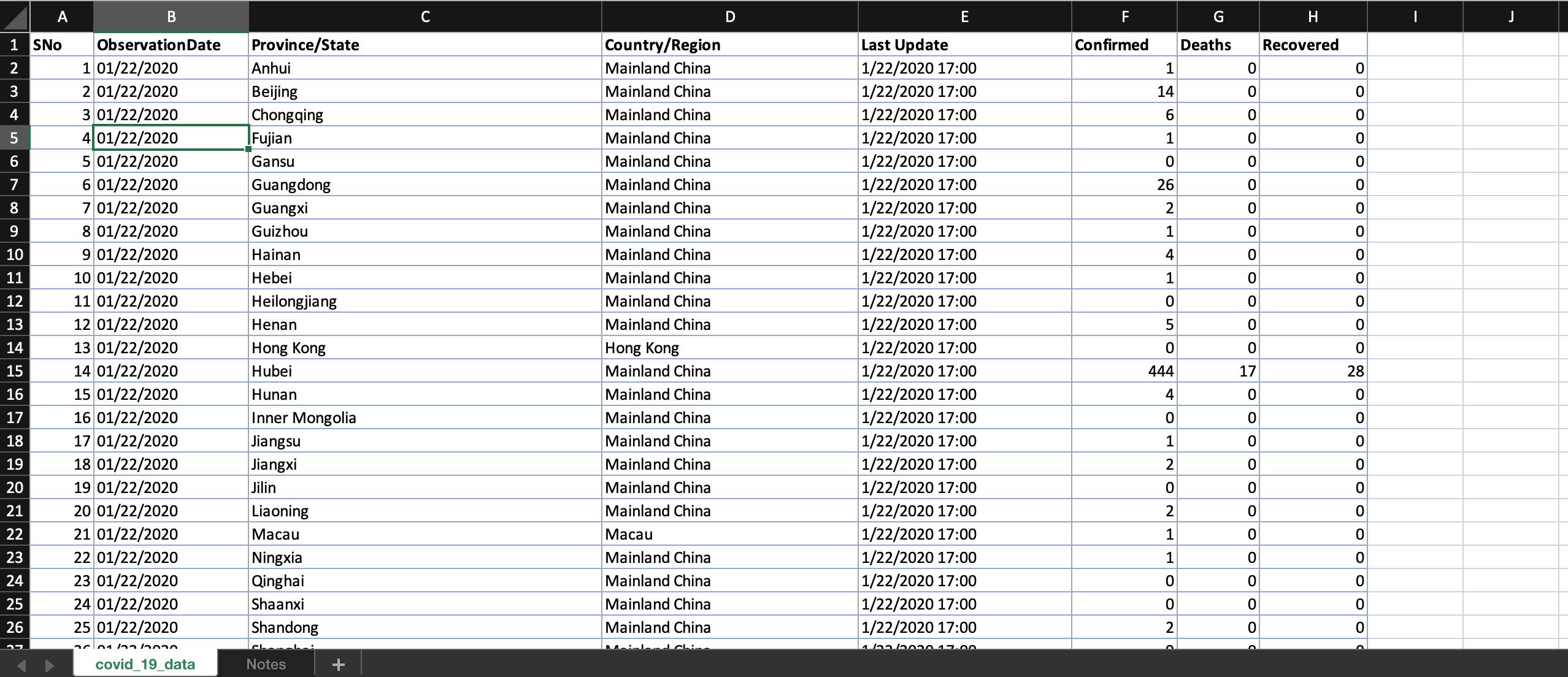
The data is a Comma Separated Value (.csv) file with one worksheet containing 8 columns and 306429 Rows, gathered from 2020 to 2021.
Column Titles in the order they are arranged viz:
- SNo
- ObservationDate
- Province/State
- Country/Region
- Last Update
- Confirmed
- Deaths
- Recovered
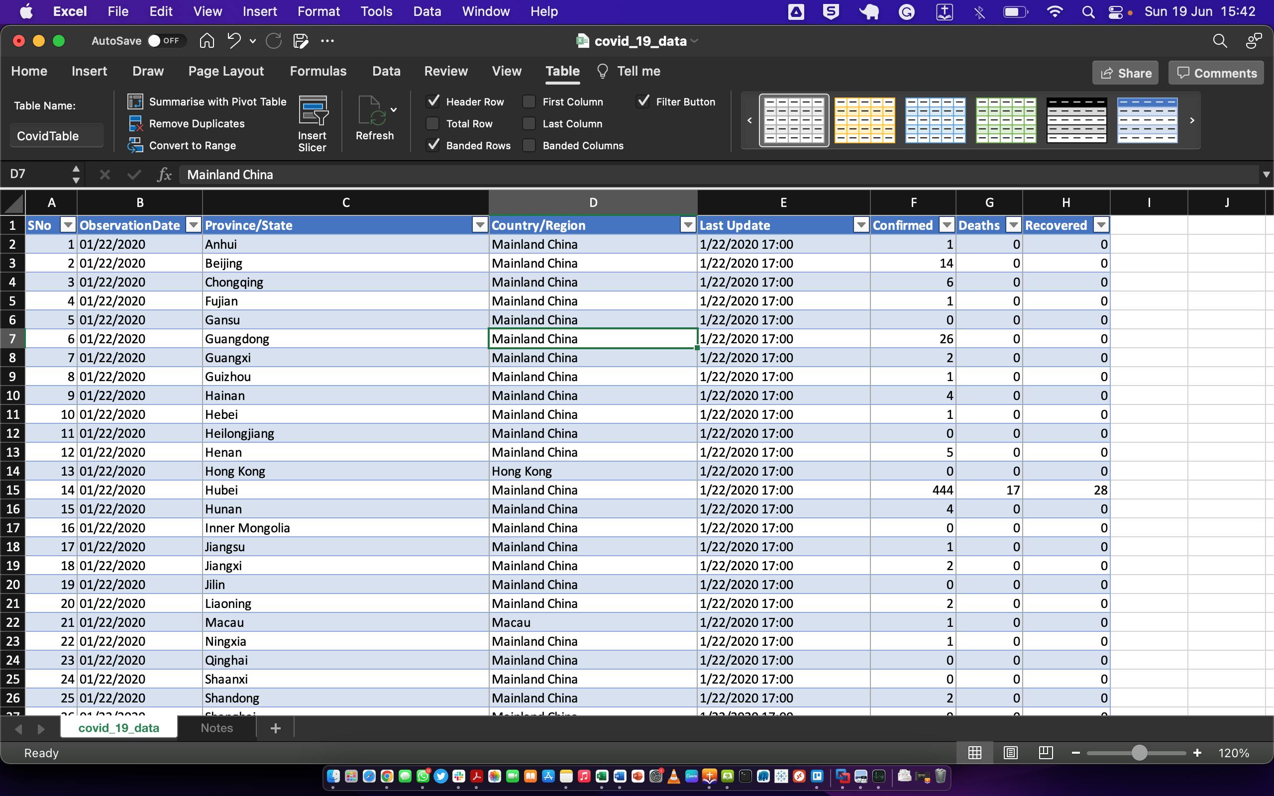
THE CLEANING PROCESS
The cleaning was done on Microsoft Excel before being loaded on PowerBI. During the cleaning, No Duplicate Values were found, we adjusted/changed Data Types accordingly, and then created and renamed the raw data Table as "CovidTable".
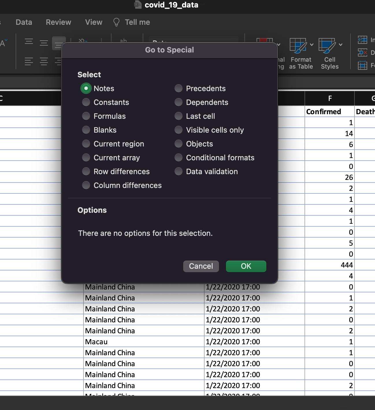
228,330 Blanks in Province/State were replaced with "Unregistered" using the "GoTo Special" part of the "Find and Replace" option of the Home Tab on Excel to fill all the blanks at once.
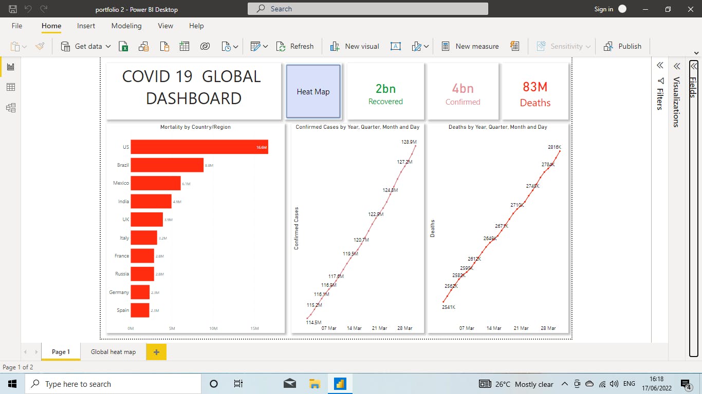
THE VISUALIZATION AND DASHBOARD The Data was then Uploaded to PowerBI to create 3 different dashboards to define the diverse valid opinions of each team member.
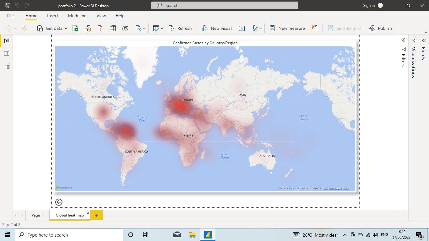
The first Dashboard Opinion created a dashboard of a column chart representing Mortality by Country/Region, a heat map showing the degree of COVID19 infection concentration by continental volume, and 2 Line charts to show growth per time of Confirmed Infection and Death Cases.
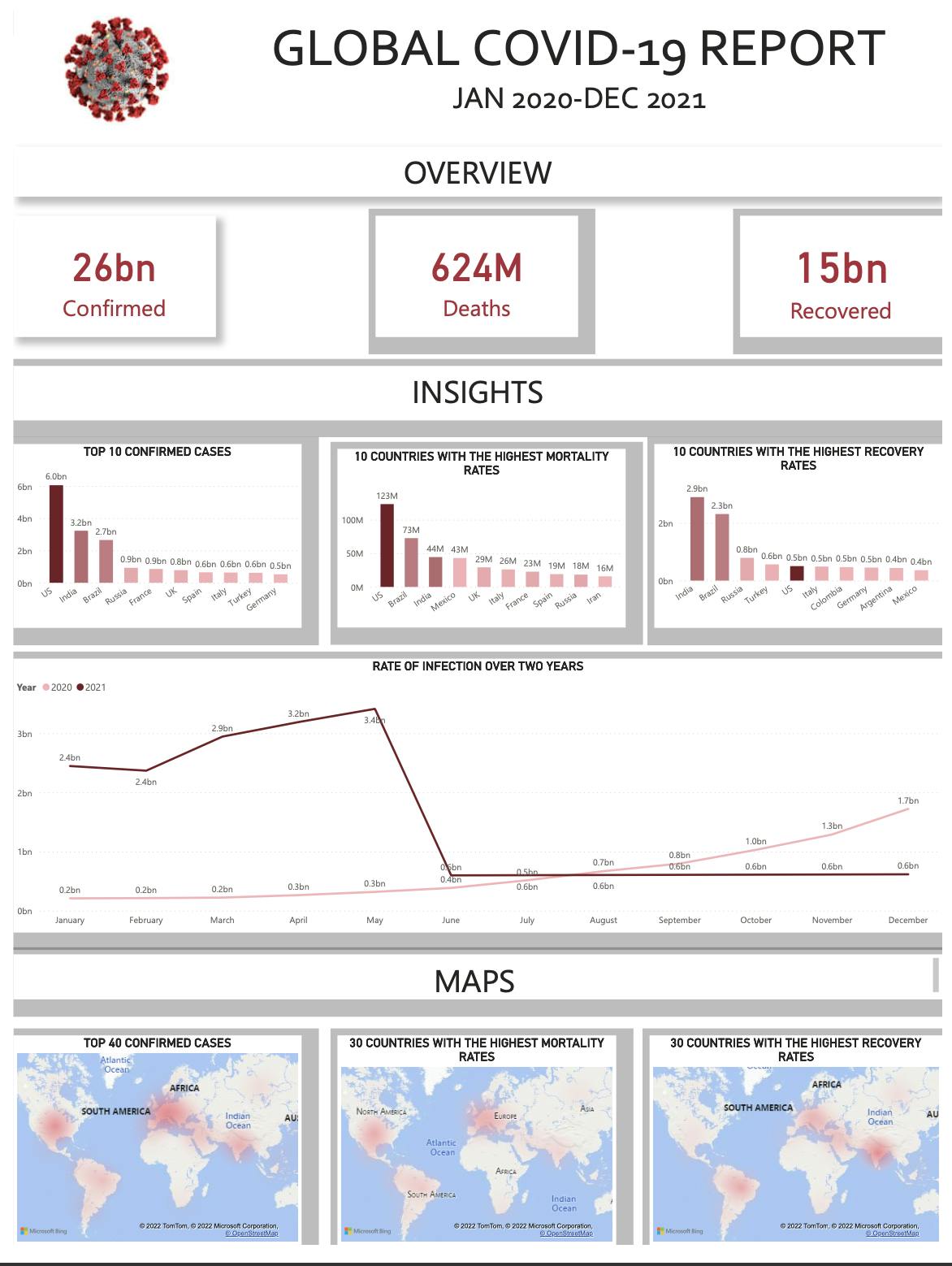
The Second Dashboard Opinion created shows 3 Cards of Confirmed infection cases, Death by COVID19 cases and the number of recovered cases, It shows 3 Bar charts displaying the Top 10 Countries by Confirmed Infection Cases, Top 10 countries with the highest mortality rates as well as Top 10 countries with the highest recovery rates.
This dashboard went on to show the rate of infection in 2020 vs that of 2021. It showed the steady exponential rise from January to December 2020 (0.2 Billion to 1.7 Billion), the abruptly high start of 2021 infection rate in January and the drastic drop from May to June 2021, to the end of 2021, closing at 0.6 Billion people infected.
This dashboard closed with 3 heat maps at the bottom of the Page showing the Top 40 Confirmed cases country, the Top 30 countries with the highest Mortality rate and the Top 30 countries with the highest recovery rates.
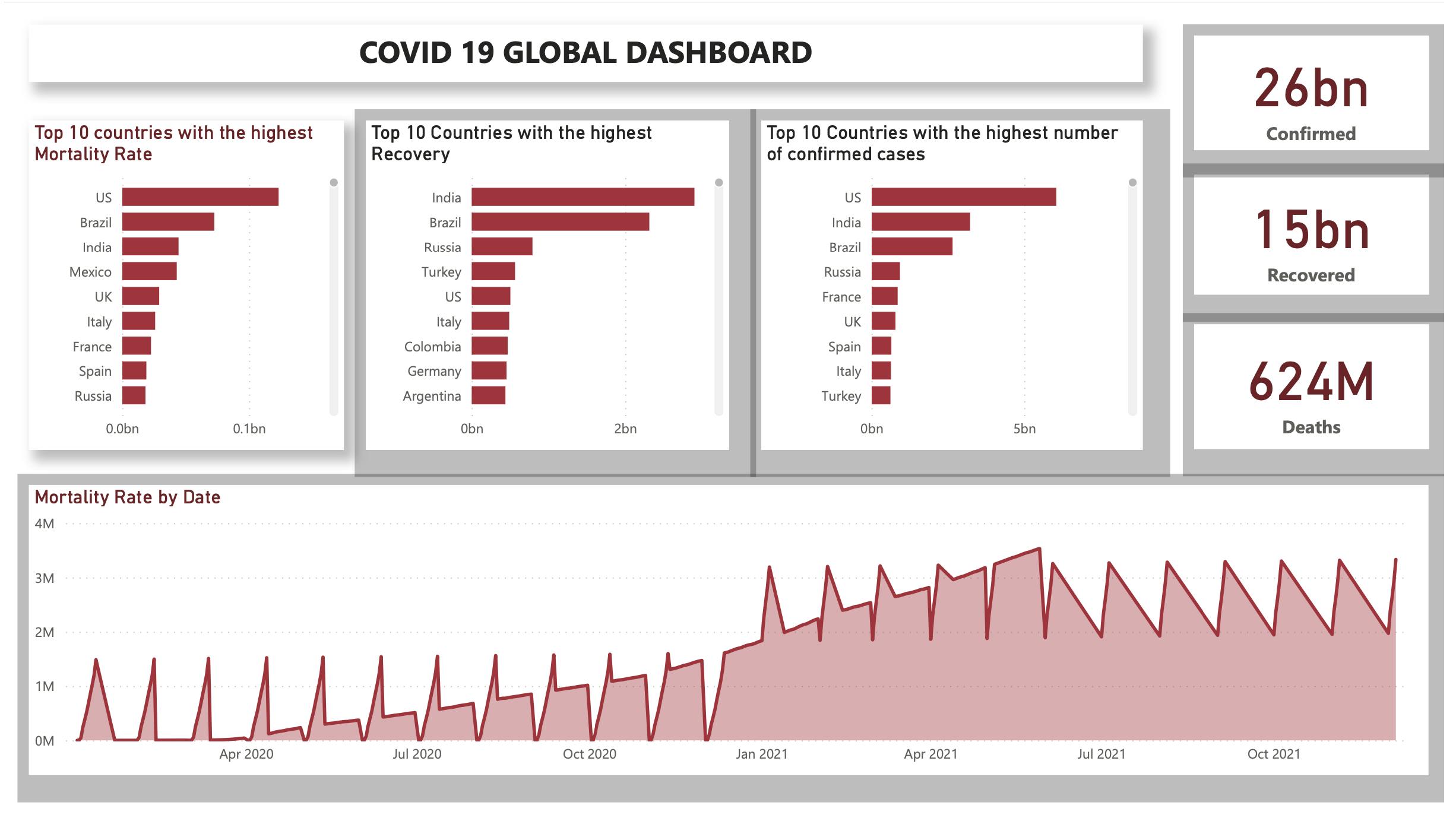
The Third Dashboard has 3 cards, 3 Bar Charts, and one long 2-D Area Line Chart.
The 3 cards show the number of confirmed cases, the number of recovered cases and the number of death cases.
The 3 Bar charts show The Top 10 Countries with the Highest Mortality Rate, The Top 10 Countries with the Recovery Rate and The Top 10 countries with the highest number of infection confirmed cases.
The long 2-D Area line chart shows the Mortality Rate by Month and Quarter, from the First Quarter of the year 2020, spanning from April to July to December to January 2021 with a steady increase until June 2021, when there start to show a slight monthly decline and rise until December 2021.
Thank You for taking your time to go through the good works of my team's hands and how we think when we see data.
Enjoy.