


Welcome again, to the 4th week of my Data Analytics journey as a Team lead at a Side Hustle Bootcamp. By now I am confident you look forward to My weekly gist on what my teammates and I have been up to so follow me.
WEEK 4 PROJECT TASK
Work on Airport Operational Performance Analysis for Airports (could be outside Nigeria)
Options
- Airport Economy: incorporating costs, income, and profit, Airport Environmental Issues: consisting of noise considerations, water quality, energy consumption, etc,
- Airport Safety and Security: incorporating both works to prevent and handle accidents (safety) and threats originating from humans (security).
Let me not bore you with the specifics.
THE DATA
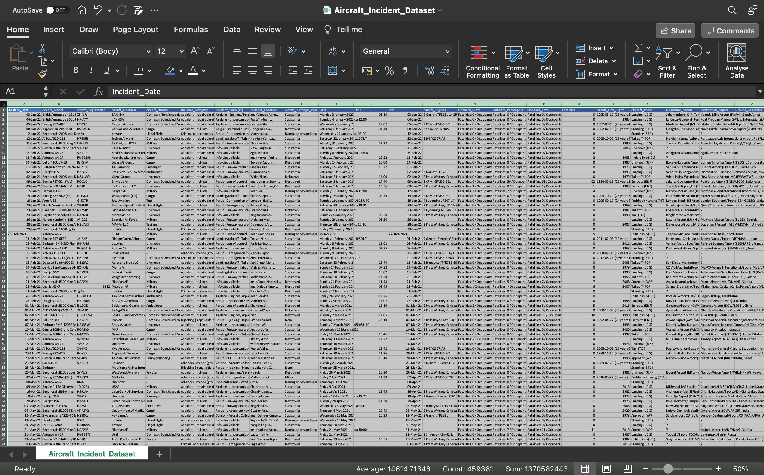
A 235,520-row, 23 Column dataset was definitely hard to find. Of the 7 days for this project, we spent 5 days looking for this and although it still didn't fit the specifics of our task, it was declared Okay for analysis. The columns were headed:
- Incident_Date
- Aircaft_Model
- Aircaft_Registration
- Aircaft_Operator
- Aircaft_Nature
- Incident_Category
- Incident_Cause(es)
- Incident_Location
- Aircaft_Damage_Type
- Date
- Time
- Arit
- Aircaft_Engines
- Onboard_Crew
- Onboard_Passengers
- Onboard_Total
- Fatalities
- Aircaft_First_Flight
- Aircraft_Phase
- Departure_Airport
- Destination_Airport
- Ground_Casualties
- Collision_Casualties
DATA CLEANING
Imported to PowerBI for ETL, in cleaning, it was quite easier on Power Query, as we knew the columns we needed and those we could ignore. We found no duplicates to remove, and replaced undefined Blanks with "unregistered" and adjusted the Data Types with a major focus on the dates, as they are pivotal to our analysis. Then we applied changes and closed Power Query.
DATA VISUALIZATION
In this dashboard, We went on to create 6 Cards, 2 Multi-row Cards, 2 Stacked Bar Charts, and a Custom Column Chart, like so:
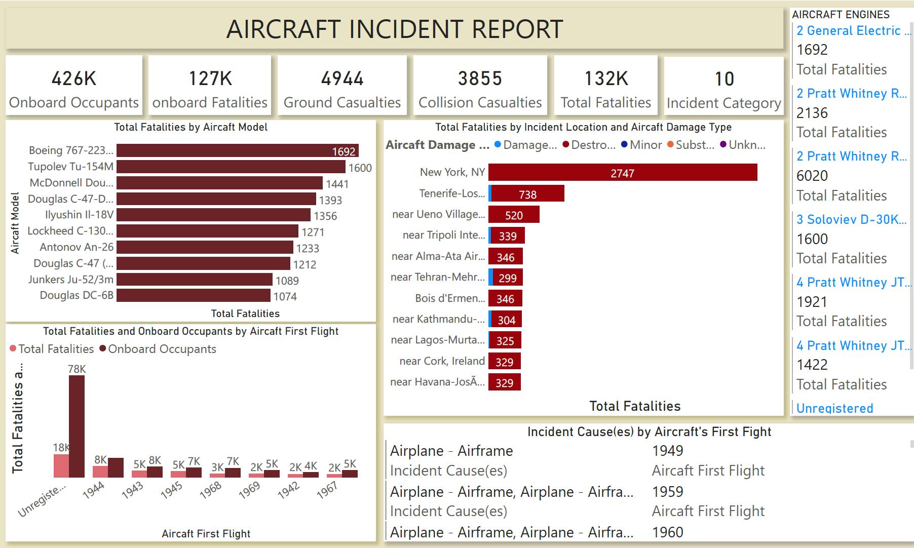
6 Cards showing:
- Total fatalities
- Onboard fatalities
- Ground casualties
- Collision casualties
- Onboard occupants
- Incident category (count)
2 Multi-row Cards including:
- Causes of the incident by aircraft’s first flight
- Aircraft engine fatalities
2 stacked bar charts including:
- Total fatalities by aircraft model
- Total fatalities by incident location and aircraft damage type
Clustered column chart including:
- Total fatalities and onboard occupants by aircraft’s first flight.
It has been truly challenging as the weeks go by and I am glad I am part of this project as I am actively learning on a daily basis about myself and where I am currently in my leadership skills as well as where I need to be if I must lead another Data Analytics team in another environment.
Do give feedback and share your thoughts.
Thank You.